40

Today we moved the site's CSS to a newly refactored LESS system so that it's easier for us to fix SE network CSS bugs globally and launch new features in the future! The updates also allow us to use SVG for retina support.

But while we were in there, we thought it would be a good idea to update the site's visual aesthetic as well, given that this design was launched over four years ago, and Google has since launched their Material Design guidelines. We drew inspiration from the Material Design colors, typography, and animations plus the other wonderful sites and apps that use these design principles.

We've fixed a LOT of obscure bugs that arose when new features were not thoroughly tested across the entire network. This update should retro-actively fix most of the old design bugs. Once the site is live, if you see any new ones, or old ones not yet fixed, please post an answer here to let us know!

12
  • Looking forward for the update, especially the animations! :)
    – Andrew T. Mod
    Commented Apr 2, 2015 at 2:09
  • 3
    "typography" - so this means we will have Roboto finally? :D
    – hichris123
    Commented Apr 2, 2015 at 2:16
  • And speaking of "material design" (Lollipop): I indeed stopped noticing we're still on Honeycomb here... :) Just hoping the new design breaks no scripts (especially the AutoReviewComments with our "canned responses", as that would be really nasty). So thanks for the warnings – so we can watch out what will happen!
    – Izzy
    Commented Apr 2, 2015 at 13:17
  • @hichris123 we have been using "Roboto" in the font stack for this site right now. Do you not see it?
    – Jin
    Commented Apr 2, 2015 at 15:14
  • @izzy We won't be adjusting any scripts, just CSS. I'm not familiar with the AutoReviewComments. Is that a custom script set up for this site?
    – Kurtis Beavers Staff
    Commented Apr 2, 2015 at 16:10
  • 2
    SE-AutoReviewComments is a helper for active users on any SE site, providing canned responses for frequent things (e.g. off-topic causes, LQ hints) – and allowing the user to define his/her own comments, adjusting existing ones, etc. Pretty useful, I wouldn't want to do without that. For some things, it hooks into #ids (e.g. #userinfo) and also .classes (e.g. .action-list). If those are not touched, the script won't be affected. Otherwise, we'll need to fix it :)
    – Izzy
    Commented Apr 2, 2015 at 16:18
  • 2
    @Izzy everything should be fine since we're not adjusting any html or class ID's, just pure CSS.
    – Kurtis Beavers Staff
    Commented Apr 2, 2015 at 16:22
  • Great! Thanks for letting us know. I'm looking forward to the new design then with much more optimism (disclosure: I'm part of the dev crew of that userscript :) – or better put: with "positive anticipation only". Plain sunshine, big clouds are gone :)
    – Izzy
    Commented Apr 2, 2015 at 16:25
  • @Jin Now I do. ;) I meant on non-Android devices - meta.android.stackexchange.com/a/785/44836.
    – hichris123
    Commented Apr 2, 2015 at 19:46
  • 6
    That's perfect. Great job. And WOW, the voting animations!!!
    – nicael
    Commented Apr 2, 2015 at 21:20
  • 2
    Just wanted to confirm: No script got broken. And after the "usual confusion" (it's been quite a time with the previous design), I must say I love it! Congrats!
    – Izzy
    Commented Apr 3, 2015 at 16:40
  • 2
    Is the new logo supposed to look like an acorn? Commented Apr 11, 2015 at 2:26

7 Answers 7

18

Overall I like the new theme. Feels much fresher.

A couple of things I'd like to mention:

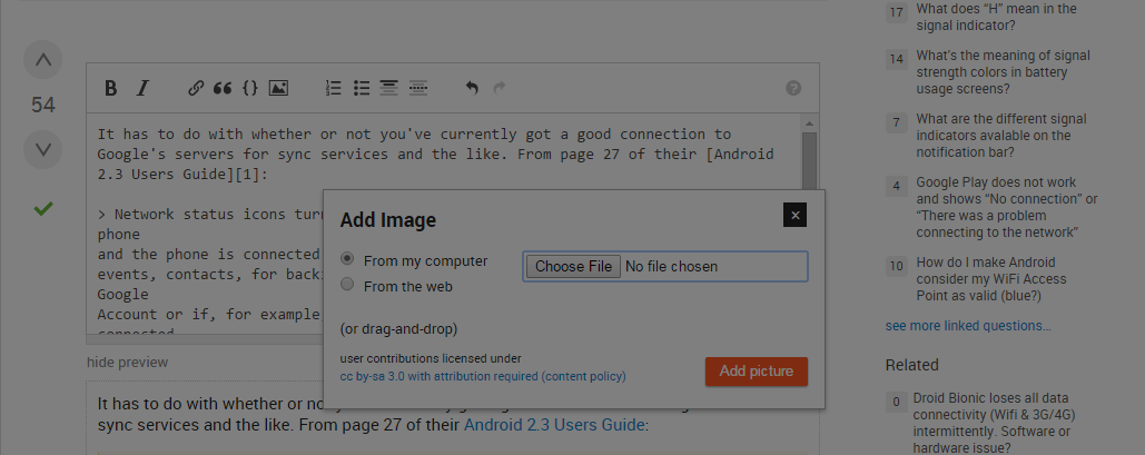
  1. Adding images to posts doesn't seem to be working for me now. The transparent gray overlay appears on top of the modal. Trying to click the dialog instead causes a click on the transparent layer, which dismisses the dialog. This is Chrome 41, Windows 7. The below images were added by editing a post on a different site and copying the links over here.

    image bug

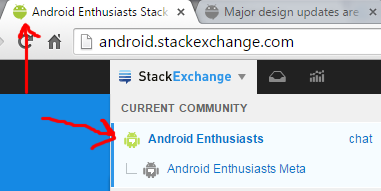
  2. The icon in the SE menu is different from the favicon. Is there a plan to make these the same? I like the favicon much better, personally:

    icons

  3. Speaking of icons, the one in the header logo on the main site is very faint. I actually like it better in green, because right now you can barely see it due to the lack of contrast. I understand if this may have been a deliberate choice, but I personally think it looks odd. Excuse my poor Paint.NET skills on this one, but here's a kind of general comparison.

    current logo green logo

5
  • 2
    Thanks for your feedback! #1&2 are fixed. You may need to refresh your browser to see the changes. For the logo, it was a deliberate design choice to use a more subtle logo in the header.
    – Kurtis Beavers Staff
    Commented Apr 2, 2015 at 20:02
  • 6
    I'm down with subtle, but the blue is really hard to see. Maybe make it a bit lighter, or a faded green or something.
    – Matthew Read Mod
    Commented Apr 3, 2015 at 1:42
  • @KurtisBeavers as for the logo: what about a little drop-shadow? #hlogo a {filter: drop-shadow(5px 5px 5px #222);} (basically "stolen" from this SO answer looks fine to me, also here on Meta :)
    – Izzy
    Commented Apr 4, 2015 at 17:14
  • @Izzy But is drop-shadow "Material"?
    – MrWhite
    Commented Apr 14, 2015 at 13:29
  • 2
    @w3d who cares – as long as it looks good? :)
    – Izzy
    Commented Apr 14, 2015 at 13:42
7

The icon has been updated.


I like the design as well.

The "flair" icon needs to be updated as it is using the older version:

flair icon

5
  • 5
    shouldiblamecaching.com
    – Doorknob
    Commented Apr 2, 2015 at 23:08
  • @Doorknob I have cleared my cache. The flair icons have not updated. In fact, look at eldarerathis answer. Commented Apr 3, 2015 at 0:37
  • 2
    Not your browser cache, @Doorknob is talking about server cache. The flair is only updated every 24-48 hours.
    – grg
    Commented Apr 3, 2015 at 11:22
  • 2
    I believe it's a server caching issue. I'll investigate. Either way, it should be updated soon. Thanks.
    – Kurtis Beavers Staff
    Commented Apr 3, 2015 at 12:09
  • @KurtisBeavers it is at least for me. Marvellous job you guys did, kudos!
    – Izzy
    Commented Apr 3, 2015 at 18:56
3

Two things I'd mention:

  • The primary top-left android logo is too similar in colour to the background

  • The Ask Question button could be highlighted, à la a floating action button, in a different colour and slightly raised.

2
  • For your first point, look at this: For the logo, it was a deliberate design choice to use a more subtle logo in the header. – Kurtis Beavers Commented Apr 8, 2015 at 14:51
  • 5
    @Alagaros There's subtle, and then there's too subtle. I think just bring it out a little bit, not change it entirely.
    – fredley
    Commented Apr 8, 2015 at 14:54
3

This is great, looks really nice, except:

Since when's Android blue? You should use the "Android green" for header and/or logo (CC-BY) listed on http://developer.android.com/distribute/tools/promote/brand.html#android-robot.

When you're saying

fix SE network CSS bugs globally

it assumes that other sites have the same design, but they don't, when will this be live on StackOverflow, SuperUser, Unix, ...?

3
  • Other sites have the same base structure and use a shared CSS file. Each site then has a custom CSS layered on top for custom site styles. StackOverflow, SuperUser, and Unix have already been updated to use the same base stylesheet.
    – Kurtis Beavers Staff
    Commented Apr 13, 2015 at 12:50
  • But they're not materialistic :( They may use base, but it looks like they override everything then...
    – TWiStErRob
    Commented Apr 13, 2015 at 12:54
  • Certain things are consistent from site to site that weren't before. Most of these things that are now the same are barely noticeable to the naked eye, but make a big difference when you need to release the same features or fix the same bug globally — things like margins, padding, and column width. We wanted to keep consistency where it was essential, but still allow for customization where we could.
    – Kurtis Beavers Staff
    Commented Apr 13, 2015 at 12:57
3

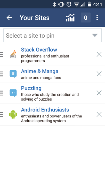
The icon has been updated.


And same goes for the logo in the android app.

Screenshot

4
  • 1
    sigh the Android app...
    – C. Ross
    Commented Apr 13, 2015 at 17:21
  • @C.Ross whats wrong with it? Commented Apr 13, 2015 at 17:31
  • have they fixed the bug where tapping on a notification would take me to the side bar inbox, but not the post the notification was about?
    – C. Ross
    Commented Apr 13, 2015 at 23:37
  • @C.Ross I'm pretty sure they fixed that a while ago, not something I experience when using the app. Commented Apr 14, 2015 at 6:34
2

The outline for the poster's name can overlap the other parts of the comment:

enter image description here

link

0

Ouch, the animations!

There are now animations for routing actions such as hovering over a voting arrow, or clicking a voting arrow. This is horrible.

Animations attract the user's attention. Attracting the user's attention to what is under the cursor is pointless: the cursor is already there. Attracting the user's attention to a routine action such as voting is wrong, especially since it's merely providing feedback that the button has been clicked.

Wasting the user's attention on something that doesn't require attention is bad user experience. Please remember that you're designing a site to be usable, not to showcase the latest capabilities of CSS 4.2 on Chrome 2016. A usable interface is an interface that doesn't get in the way. Animations triggered by routine events and that grab the user's attention to tell them nothing whatsoever are the antithesis of usability.

Please remove all animations that do not convey information that warrants action.

6
  • 1
    I disagree with the statement that "attracting the user's attention to what is under the cursor is pointless" and that voting is a routine action that doesn't merit special attention. Keep in mind that a majority of the users on the site are not high reputation users. The interaction is a very subtle hint that their upvote or downvote has meaning and a weight to it. On desktops hovering is an interaction and the animation is meant to be a small delightful detail. I strongly disagree that clicking does not merit an animation especially on a site about android: tinyurl.com/pv7u2pz
    – Kurtis Beavers Staff
    Commented May 19, 2015 at 17:23
  • 1
    @KurtisBeavers “Each interaction is thoughtful, perhaps whimsical, but never distracting”. Animations badly fail at not being distracting. Lighting up the button after clicking is good feedback. Making it move isn't. Commented May 19, 2015 at 17:35
  • 1
    @giles, you could use your same argument for all of the animations on Google's Material design site.
    – Kurtis Beavers Staff
    Commented May 19, 2015 at 17:39
  • I'd guess this answer is a response based on this request on MSE.
    – Andrew T. Mod
    Commented May 22, 2015 at 4:08
  • @AndrewT. I'm not a frequent visitor to Android Enthusiasts, so indeed, the MSE thread is how I learned about that new feature. I came to Android Enthusiasts, saw how annoying it was, and responded both on MSE and here at Kurtis's request. Commented May 22, 2015 at 8:29
  • @KurtisBeavers Today I voted on AE. I'd forgotten about this. Ouch! I still don't understand why the site goes out of its way to be annoying. Commented Aug 10, 2015 at 20:48

You must log in to answer this question.

Not the answer you're looking for? Browse other questions tagged .